Beans rebrand & packaging design
INTRODUCTION
This was a packaging design concept looking at rebranding & re-designing Bold Bean Co’s packaging.
Bold Bean Co have taken one of the most overlooked & (let’s be honest) dull food staples & turned it into something delicious. They’re so good, you don’t even want to waste the stock.
Most beans on the market? Cooked to death, often with additives & sold in unexciting packaging. The bean industry cuts corners because properly soaking, slow cooking & packing beans doesn’t make financial sense.
But Bold Bean Co do it the way it’s meant to be done. No additives. Just beans, water & a pinch of salt. With none of the water from soaking being used in the final pack. These are beans cooked for flavour. They’re the kind of beans chefs serve in Michelin starred restaurants.
This project looked at creating packaging that could bring that same energy to the shelf.
THE CHALLENGE
Bold Bean Co already had the taste factor locked in. But supermarket shelves are a battlefield & as a challenger brand, they needed to do three things:
Stop shoppers in their tracks. Make them notice the product on shelf.
Disrupt habits. Get people to switch from their usual brand.
Sell the story. Convince consumers that premium beans are worth the price.
THE STRATEGY
Beans have an image problem. Here in the UK at least, they’re seen as cheap student food or a way to replace meat. Not exactly exciting.
On top of that, it’s common to find beans packed with calcium chloride (E509) for firmness or calcium disodium EDTA (E385) for colour.
Bold Bean Co does none of that. They make beautifully cooked beans & where possible from regenerative farms. So, the strategy was clear:
Show beans as premium. These aren’t a filler food, these can lead a meal.
Make the purity obvious. No chemicals, no shortcuts, no compromise.
Create desire. These beans aren’t just better for you, they’re a joy to eat.
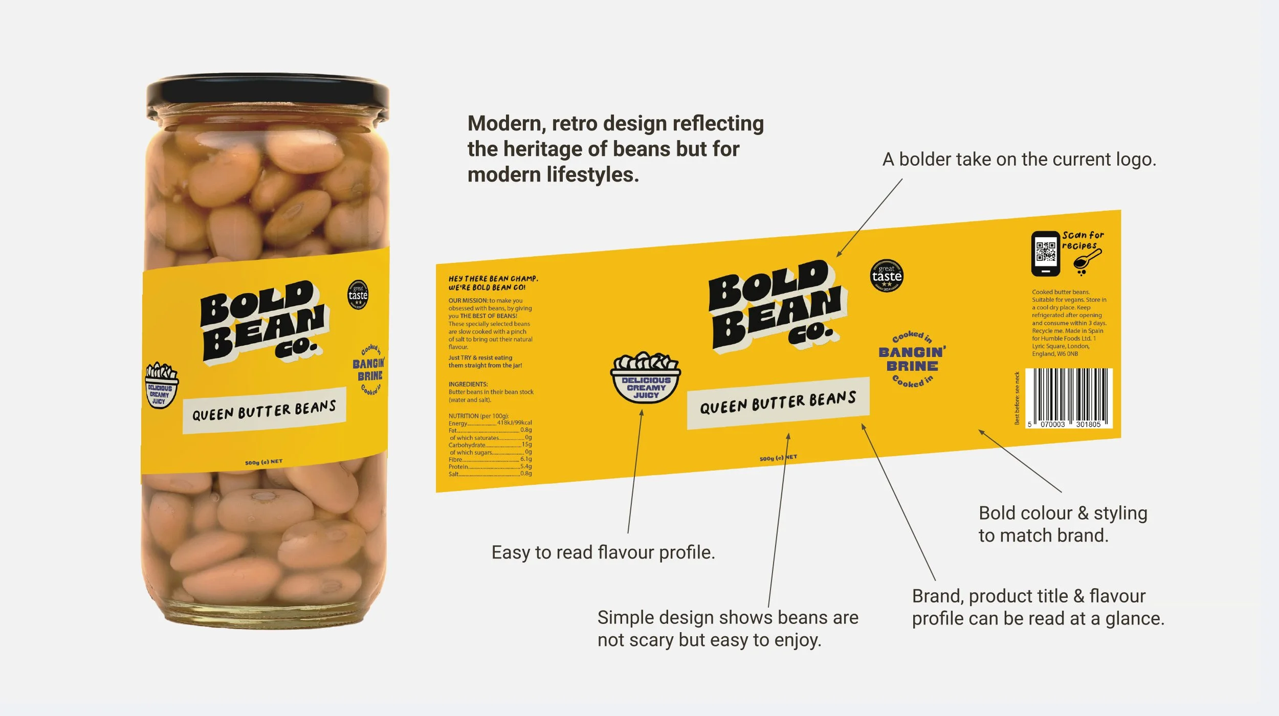
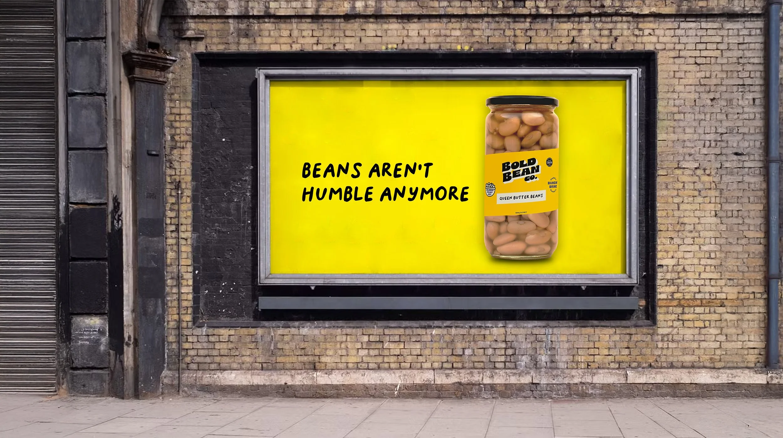
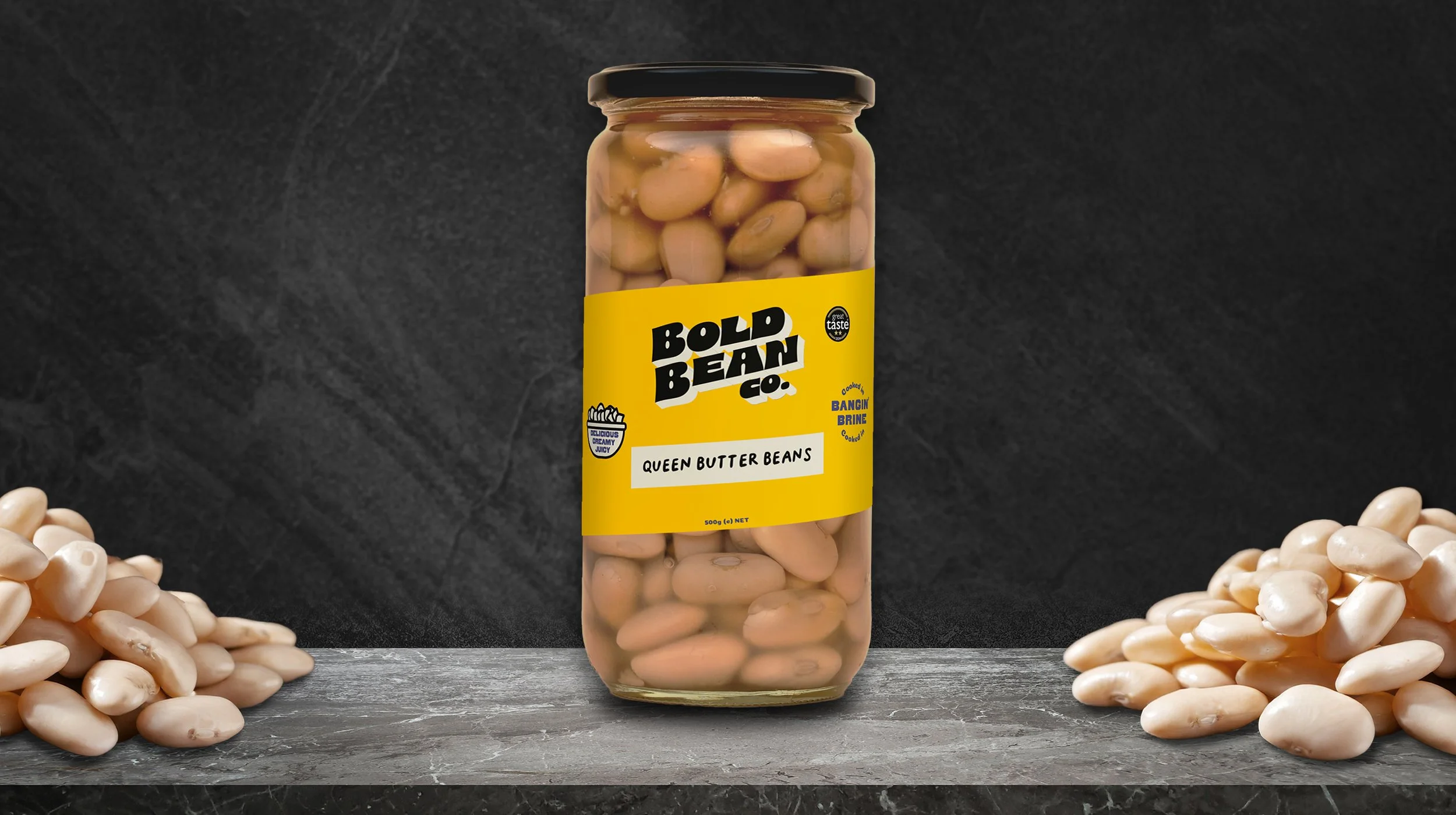
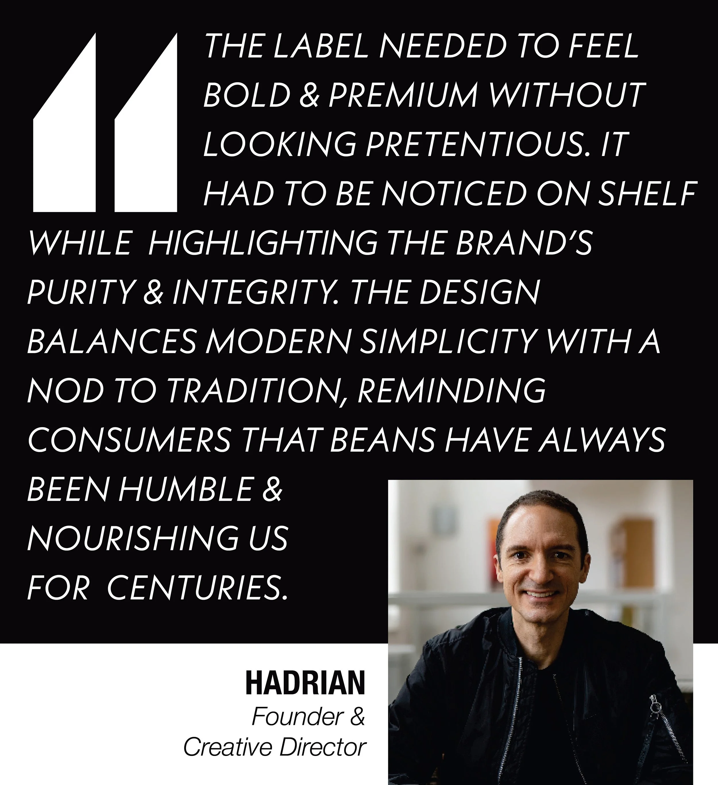
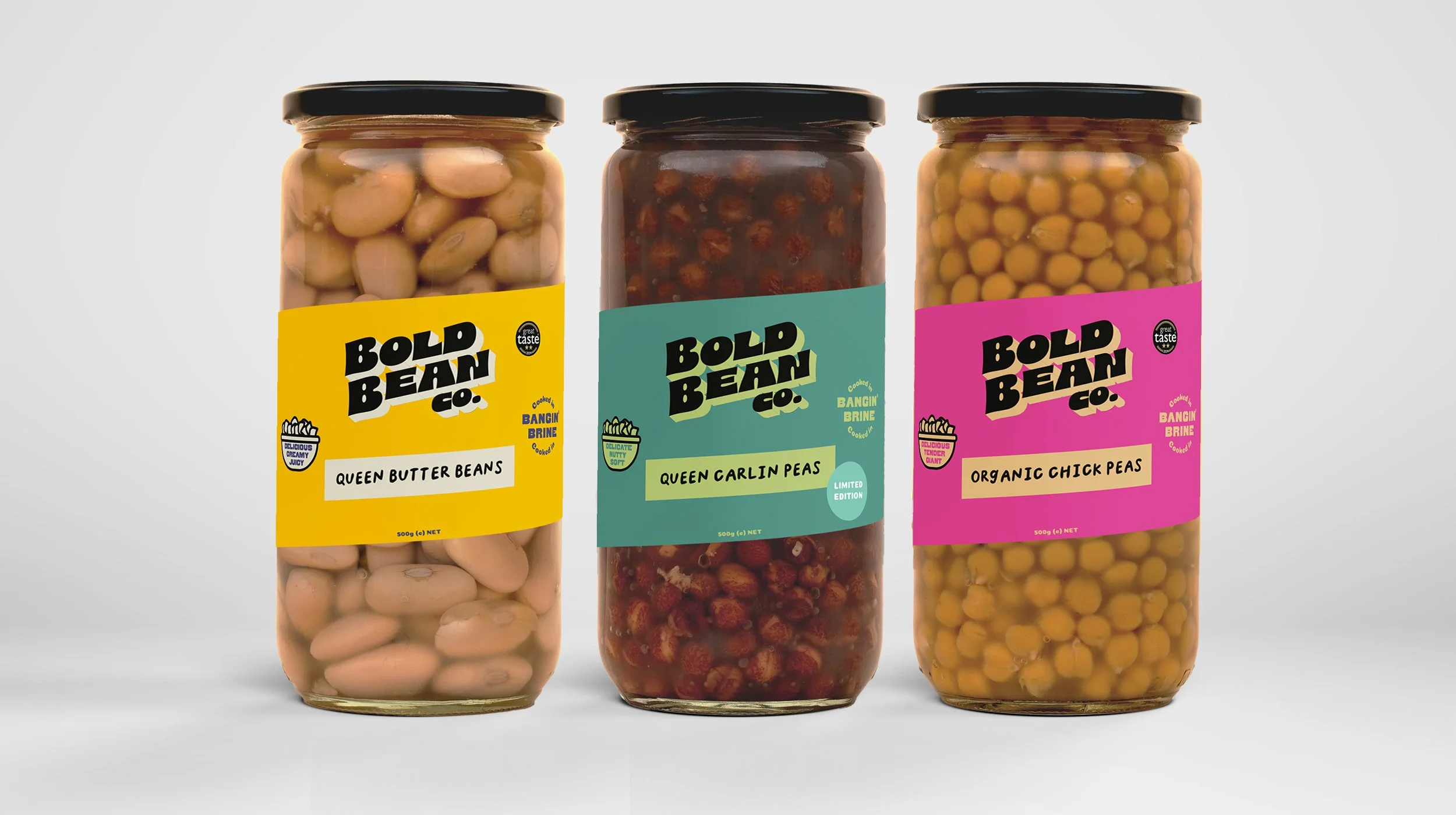
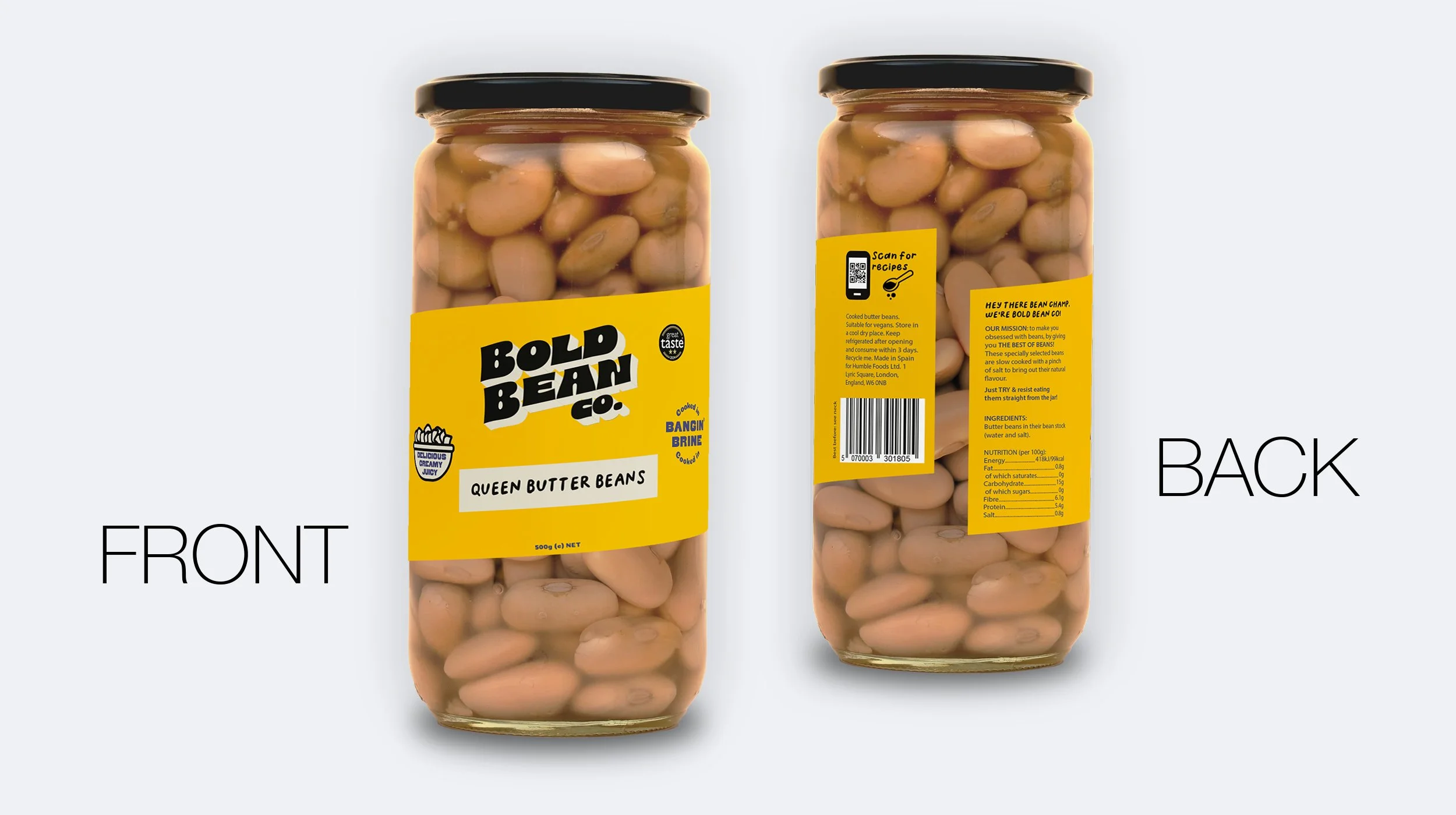
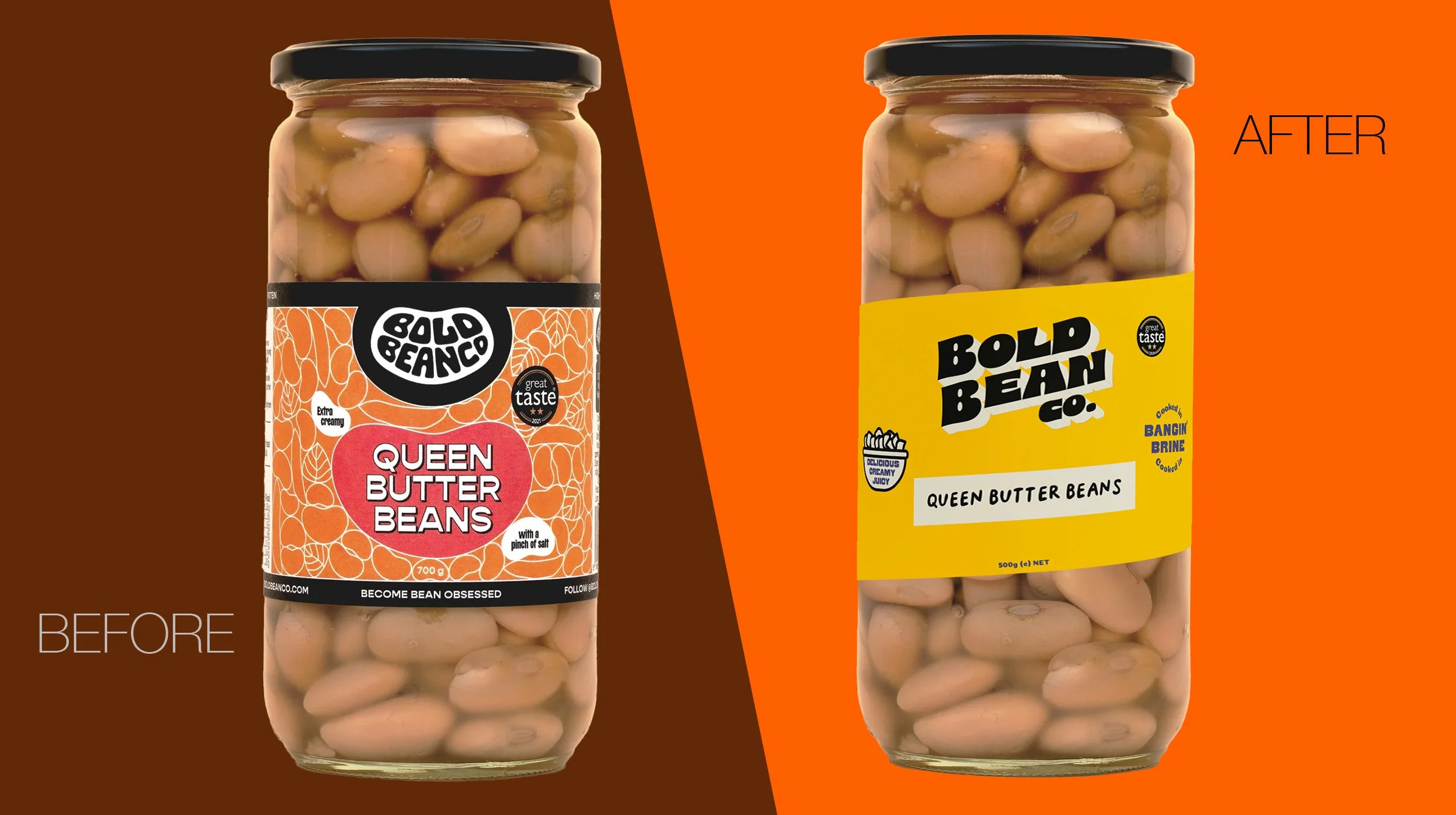
PACKAGING DESIGN
In a crowded category Bold Bean Co packaging needed to look as fresh & vibrant as the contents.
The new packaging had to have:
Visibility: The design had to be seen from across the aisle & be impossible to ignore.
Premium cues: Clean & modern while tapping into the heritage of beans so customers instantly knew this wasn’t just another tin of beans.
Appetite appeal: A design that makes you hungry & curious.
The result? Packaging that feels as exciting as the product itself & with a real presence on shelf to get noticed, whichever better known brands are positioned next to it.